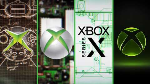
From Atari to the Zemmix, every gaming console requires a distinct brand identity to stand out in a crowded market. Microsoft has mastered this art over the last 25 years. For decades, the visual identity of the Xbox brand has been defined by two unmistakable elements: a specific shade of green and various iterations of a central orb.
As the industry shifts, so does the branding. With new leadership stepping in following the departure of longtime steward Phil Spencer, the company is signaling a potential reset. Between promises of returning to brand roots and rumors surrounding the successor to the Xbox Series X|S, known as Project Helix, a brand refresh feels imminent. To understand where they are going, we must look at how the Xbox logo has transformed from simple text into a modern icon.
The Early Years: From Edgy Text to the Iconic Orb
1999: The "DirectX Box" Origins
The story begins in the late '90s with four engineers from Microsoft's DirectX team aiming to take on industry giants like Sony and Nintendo. While the project was originally referred to as the "DirectX Box," marketing surveys eventually cemented the name "Xbox." At this stage, there was no icon; the brand relied on a combination of unique font choices and a bright lime-green color to differentiate itself from the competition.
2001: The Arrival of the "X"
As the console officially launched in 2001, the visual identity underwent its first major shift. The logo adopted angular fonts and shapes, featuring a distinctive "X" symbol designed to fit the era of nu-metal music and extreme sports. This wasn't just a static image; it looked like an explosive gash ripped into the branding, giving the brand an aggressive, high-energy feel.
2005: The Birth of the Sphere
With the launch of the Xbox 360, Microsoft introduced a massive evolution in hardware and aesthetics. To match the high-tech push, the logo moved away from the "extreme" look toward something more sophisticated. This era introduced the legendary "X sphere," a detailed orb that referenced the new home button on the 360 controller.
The branding during this period included several key shifts:
- The introduction of a central, attention-grabbing orb.
- A transition toward grey tones in the official text.
- A more polished, "high-tech" aesthetic to match the new hardware capabilities.
The Evolution of Modern Branding
2010–2012: Refining and Flattening the Design
By 2010, the orb had become highly detailed, utilizing subtle gradient shades that felt premium—moving from a "DVD" look to a "Blu-ray" level of polish. However, this complexity didn't last forever. By 2012, Microsoft decided to scale back, stripping away the metallic accents and returning to a 2D design. During this time, the signature green also took a turn toward a much darker shade.
2013: The Xbox One Era
The launch of the Xbox One saw a strange visual flip-flop. While the text remained consistent, Microsoft brought back a version of the 3D orb. It lacked the extreme detail of the 2010 era, but it remained a core part of the identity, even as leadership navigated a period where gaming wasn't always the primary focus of the console's direction.
2019–Present: Painting it Black
Following several years of rebuilding through acquisitions and the massive success of Xbox Game Pass, the brand underwent its most radical change in 2019. Moving away from the vibrant green that defined the early decades, Microsoft adopted a minimalist, "black" aesthetic.
The modern era is characterized by:
- A simplified 2D logo layout.
- The removal of the signature lime-green in favor of monochrome tones.
- A corporate, streamlined look for the Xbox Series X|S hardware.
While the current branding feels more "corporate" than the edgy origins of the late '90s, it reflects a brand that has moved from an underdog challenger to a global ecosystem powerhouse. Whether this minimalist direction is a permanent fixture or a precursor to a new era of design remains to be seen.