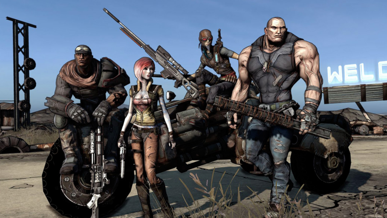
It is difficult to imagine the Borderlands franchise without its iconic stylized ink lines and vibrant chaos. However, when the game was first teased nearly two decades ago, it looked significantly different—much greyer, more brooding, and reminiscent of the gritty shooters typical of the late 2000s.
According to a recent interview with podcaster David Senra, Take-Two CEO Strauss Zelnick revealed that the iconic Borderlands art style was the result of a massive overhaul that cost an additional year of development and approximately $50 million.
The Risky Decision to Remake Borderlands
The decision to pivot mid-development was a high-stakes gamble for a company with limited capital at the time. Zelnick explained that the project was nearing completion when leadership realized they had missed the mark.
"We had not turned around the company yet, we had very limited capital, and we were developing a game that was about to be released two months later, which is to say it's done," Zelnick said during the interview. "The head of the division came into my office and said, 'Look, we just don't think this is good enough and we think we screwed up, and the art style is not appropriate and it's not differentiated, we want to remake the game.'"
Despite the massive financial implications, Zelnick chose to back the creative team. He noted that while the decision was "non-obvious" and something "no one else in the business would have done," it was ultimately the right move for the brand.
A $50 Million Gamble on Visual Identity
While Zelnick claims the overhaul cost $50 million, the figure is notably high when compared to other industry benchmarks. For context:
- Borderlands 2 had an estimated budget of around $35 million, according to former statements by Randy Pitchford.
- Early testers reportedly felt the original, "moody" version looked too similar to contemporary titles like id Software's Rage or Fallout 3.
- The shift away from the "muddy brown" aesthetic helped the game avoid being lost in a sea of indistinct shooters.
Zelnick maintained that without this pivot, the franchise might never have found its footing. "Had we not done that, Borderlands wouldn't have been a hit," he asserted.
By moving away from the generic beige and grey palettes of the era, Gearbox Software successfully carved out a unique identity. Whether or not the original version would have stood alongside classics like Quake remains a mystery, but the Borderlands art style undoubtedly became one of the most recognizable looks in gaming history.