A Glittering Rebellion: Inside Android’s New Disco Ball Icons
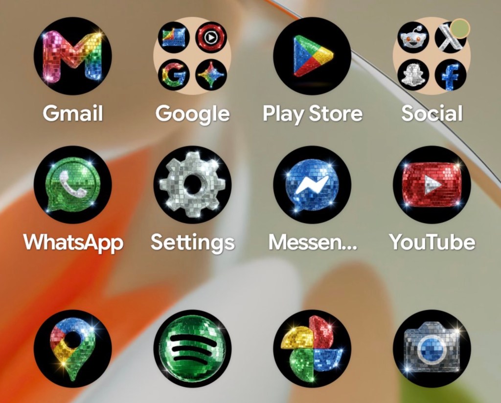
The familiar, clean geometry of Android’s Material You design language has been replaced by a sparkly, disco ball icon aesthetic that feels less like a software update and more like a chaotic costume party. On a Pixel home screen, a constellation of glittering spheres transforms every app into a miniature ballroom fixture. The Chrome browser becomes a shimmering orb, the Phone app gleams with metallic sheen, and even the Settings cog is wrapped in sequins.
It is visually aggressive, undeniably loud, and, according to Google, exactly what the ecosystem demanded.
From Meme to Official Feature
This unexpected aesthetic shift began as an internet meme but has solidified into a tangible feature within Google’s latest software iteration. The catalyst was Spotify’s controversial temporary disco ball icon, released to mark the streaming giant’s 20th anniversary. That release was met with a polarized mix of horror and nostalgic affection, prompting Google’s Android team to lean into the absurdity rather than shy away from it.
Sameer Samat, head of the Android ecosystem, took to X to announce the availability of these disco-themed icons. Posting a screenshot of a fully decked-out Pixel phone, his caption carried a dry, almost defensive tone: "Your wish is our command. Disco icons available on Pixel as of today... Are y'all sure you still want this?"
While Spotify’s version was temporary and acknowledged that "glitter is not for everyone," Google has made the disco ball icon a permanent, opt-in feature. This move aligns with a broader cultural trend toward whimsy among younger demographics. As reported by The New York Times, Zillennials are increasingly embracing playful, ironic aesthetics as a response to a difficult world. The disco ball icon fits this mold—it is nostalgic, exaggerated, and intentionally over-the-top. It is not meant to be practical. It is meant to be a statement.
The Mechanics of Digital Kitsch
The disco ball icon is not a standalone app pack but rather an extension of the custom icons feature introduced in the March Pixel Drop. This update allows users to apply AI-generated styles to their app icons, moving beyond the previous limitation of simply tinting icons to match their wallpaper. Before this update, customization was largely functional. Now, it is expressive, bordering on theatrical.
The rollout includes several distinct aesthetic themes, though the disco ball variant stands out for its sheer commitment to the bit. Other available styles offer more subdued options:
- Scribbles: A hand-drawn aesthetic that mimics rough pencil sketches.
- Treasure: A minimalist look featuring gold accents.
- Easel: A colorful, painted style for a more artistic touch.
These options provide a spectrum of customization, allowing users to dial back the whimsy if the disco balls feel too much. However, the disco ball icon remains the most talked-about element. They are available through the Pixel Settings menu, where users can navigate to Display and select Icon Style. The process is seamless, requiring no third-party launchers or complex sideloading. It is a native, official endorsement of digital kitsch.
The Verdict on User Agency
The decision to release such a specific, glitter-heavy aesthetic raises questions about Google’s understanding of its user base. Yet, the irony is palpable. Google, a company often criticized for its utilitarian design ethos, is now pushing one of the most decorative features in its history. The disco ball icon is a departure from the clean, functional aesthetic that has defined Android for years.
The availability of disco ball icons on Pixel phones is a curious development. It is a feature that serves no functional purpose, yet it has generated more engagement than many significant updates. It is a testament to the power of meme culture to influence product design.
For those who enjoy it, the icons offer a sense of personalization that feels fresh and playful. For others, they are a distraction, a glittery noise in an otherwise quiet interface. The fact that Google allows users to choose, and to easily revert to the default, is the key. It is a demonstration of user agency in an era where customization is often limited to superficial tweaks.
The disco ball icon is not here to stay forever. Like Spotify’s version, it may fade as the next meme takes hold. But for now, they are a reminder that technology can be fun, even if it is also a bit ridiculous. The question is not whether they are good or bad design. The question is whether they serve the user’s desire for expression. In that regard, they succeed.